i got a new computer in the past few months and was looking for an excuse to confirm whether the wordpad effect still works in windows 7 (it does, if slowly). so i figured i'd do a quick experiment to test a hypothesis discussed in the comments of part 1 of my databending primer—that the amount of warping caused by the wordpad effect is dependent on the relative brightness (or darkness) of the source image.
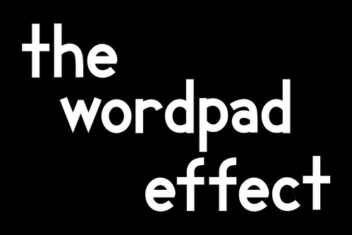
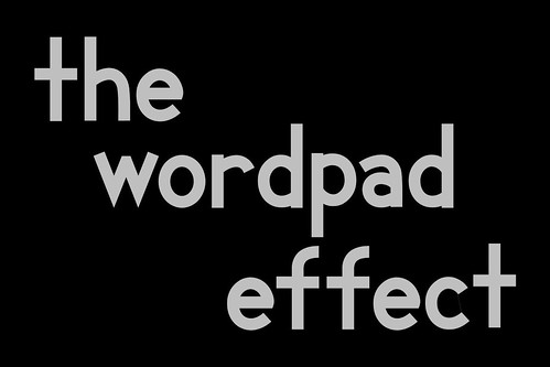
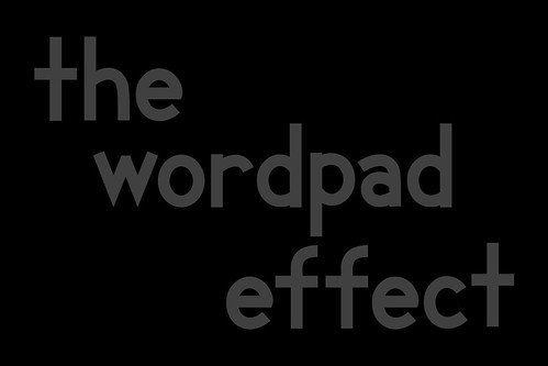
for my source image, i used variations of the same image: text on a solid background. i tried both white text on black background and vice versa, with the text at 25%, 50%, 75%, and 100% opacity. the black text on a white background showed no warping at all, regardless of opacity. this was consistent with similar experiments i've tried in the past, but still a bit puzzling.
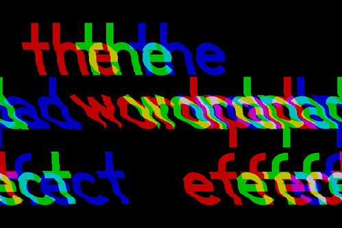
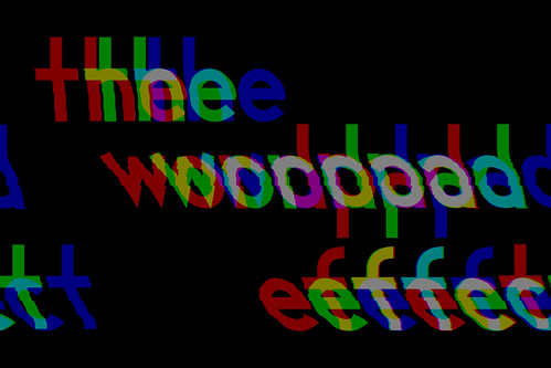
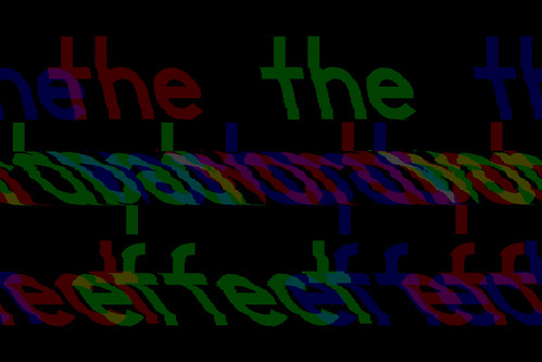
the images with white text on a black background did warp, and hinted at a pattern. [all originals were saved in photoshop raw format, non-interleaved. all images are hosted on flickr; click to go there.]
100% opacity:
75% opacity:
50% opacity:
25% opacity:
pure white (100%) on black warped, but just a little. reducing the text whiteness to 75% produced considerably more warping, and reducing to 25% produced more still. this would suggest a pattern of the text warping more the darker it gets, but that wouldn't explain the result for 50% opacity, which is less warped than 75% or 25%.
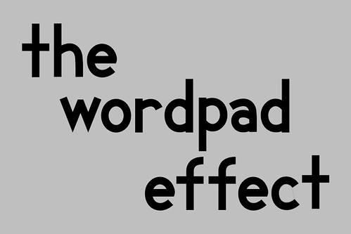
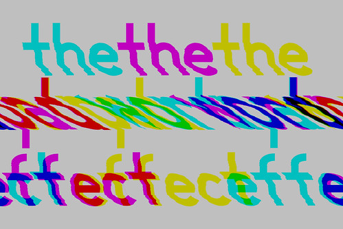
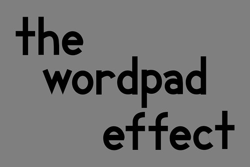
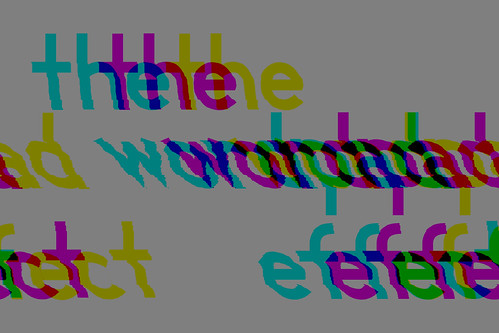
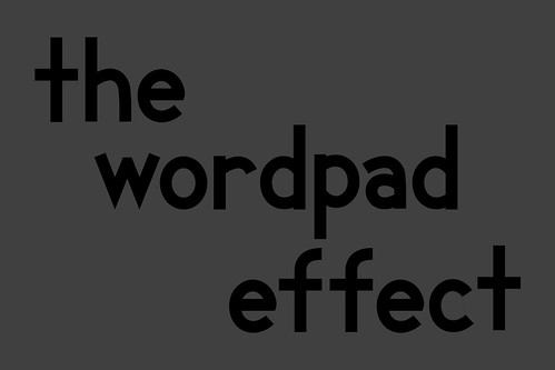
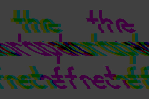
since the black-on-white experiment was a bust, i figured i'd try a couple more, this time with solid black text on a gray background.
75% white:
50% white:
25% white:
the results are roughly analogous to those from the white-on-black images: 75% white warps more than 50%, whereas 25% warps most of all.
clearly, it would seem that the source image brightness has an impact on warping, but it's not as simple as darkening an image to make it warp more. 
skip to main |
skip to sidebar


background
click to change it
background 1
background 2
background 3
background 4
background 5
solid black
solid white
background 1
background 2
background 3
background 4
background 5
solid black
solid white



1 comment:
The result was all so awesome. Carports Venice FL
Post a Comment