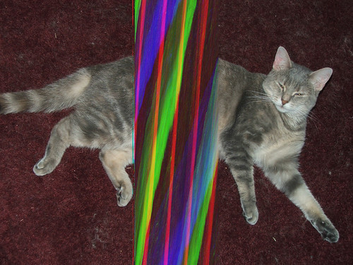
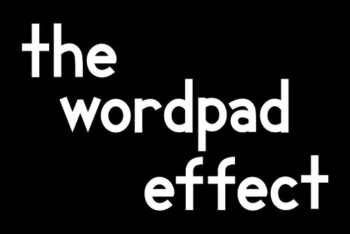
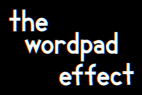
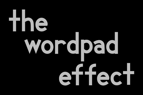
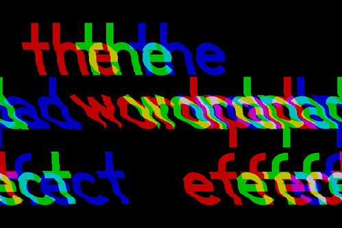
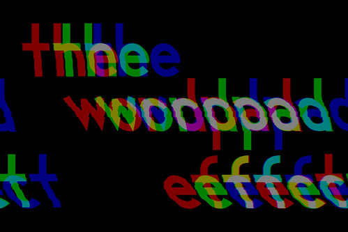
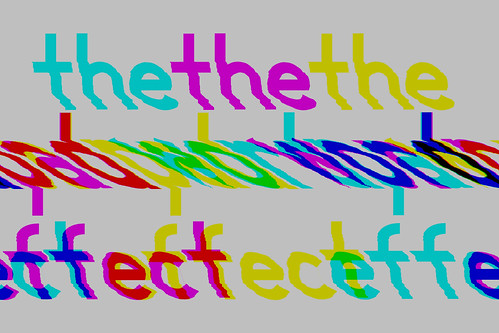
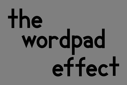
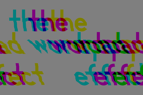
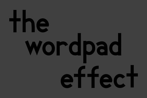
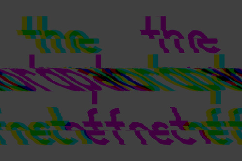
maybe you've already noticed, but my latest databending experiments build on everything i've learned about the wordpad effect in order to actually control how and where images bend:
check out the whole set here. i'll probably add more gradually as i make new ones.
and don't forget, benders: gli.tc/h starts wednesday in chicago! i'll be there, and i'll have copies of my true data 12" for a special event-only price of $5 each. i hope to see you there! 
Monday, September 27, 2010
Monday, September 20, 2010
stAllio! @ gli.tc/h conference chicago, oct 2
i can finally announce that i will perform october 2 at the nightingale theatre in chicago as part of the gli.tc/h conference!
here's the lineup for the show:
Jeronimo Barbosa (Recife, Brazil)
Andrew Bucksbarg (Bloomington, Indiana)
Ben Baker-Smith (Chicago) w/ Evan Kühl (Madison, WI)
stAllio! (Indianapolis, IN)
Anton Marini & Aerostatic (New York, NY)
check out the gli.tc/h schedule for more info on gli.tc/h events! (the preliminary schedule is up now; hopefully more details will be filled in soon.)
Friday, September 17, 2010
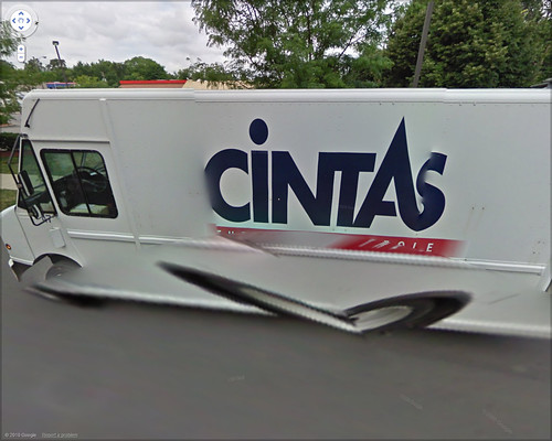
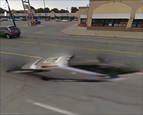
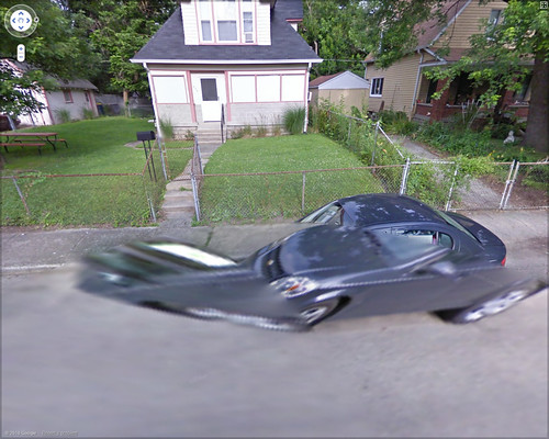
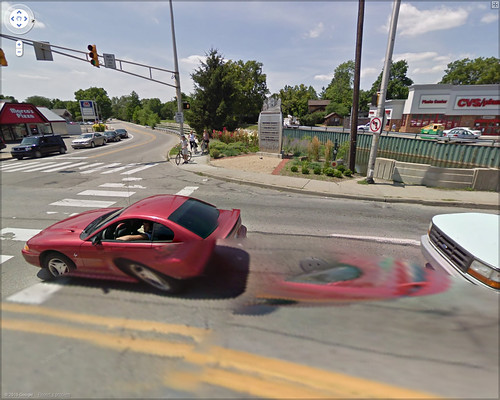
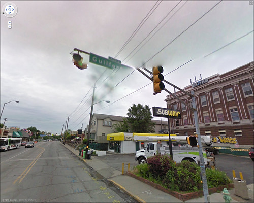
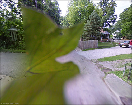
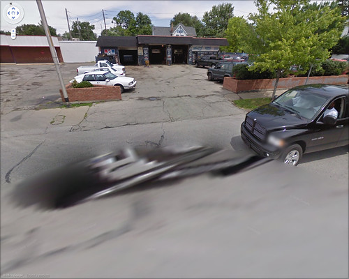
google street view glitches revisited
google keeps its street view reasonably up-to-date by refreshing it periodically, sending around new trucks with new and different cameras. this means that the street view glitches i found back in 2007 have long since disappeared.
but new trucks means new opportunities for glitches, as i discovered while digitally wandering the streets of indianapolis.
these glitches seem to involve a stitching error between the cameras at eye level and those pointed at the ground. if something happens to be physically close enough to the camera at near-ground level, it can end up pretty distorted:
a similar effect can be seen higher up—between the eye-level cameras and the ones pointed toward the sky—though it's less likely there'll be anything up there:
this last one's a real chance moment—a leaf fell on the camera:
update: click through the images to go to flickr... i've added street view links for most of them so you can see the glitches in their "natural" environment.
also, here's one more fun one:
Tuesday, September 14, 2010
a huge smash is out now!
now is the moment you've been waiting for! the new stAllio! album a huge smash—the long-awaited full-length follow-up to mash smarter not harder—is now available for free download!
a huge smash is 11 tracks of glitchy post-mashup madness. it picks up directly where mash smarter left off, as i smash pop music into increasingly smaller pieces and then weld them back together in new and innovative ways.
this is a completely free download—it's not on itunes and there's no "pay what you want" feature. all i ask is that if you enjoy the album, please share it with your friends. post it on your facebooks, your twitters and reddits, or whatever it is kids do these days. i'm giving this to you for free, and all i'm asking is that you copy and paste the link a few times. that's a price you can't beat! 
Saturday, September 04, 2010
the wordpad effect and pixel brightness
i got a new computer in the past few months and was looking for an excuse to confirm whether the wordpad effect still works in windows 7 (it does, if slowly). so i figured i'd do a quick experiment to test a hypothesis discussed in the comments of part 1 of my databending primer—that the amount of warping caused by the wordpad effect is dependent on the relative brightness (or darkness) of the source image.
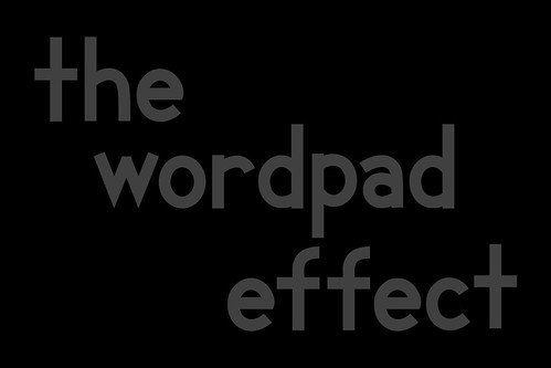
for my source image, i used variations of the same image: text on a solid background. i tried both white text on black background and vice versa, with the text at 25%, 50%, 75%, and 100% opacity. the black text on a white background showed no warping at all, regardless of opacity. this was consistent with similar experiments i've tried in the past, but still a bit puzzling.
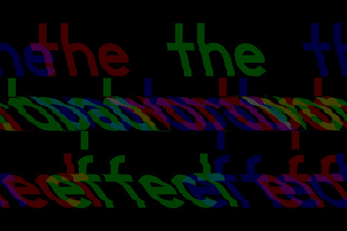
the images with white text on a black background did warp, and hinted at a pattern. [all originals were saved in photoshop raw format, non-interleaved. all images are hosted on flickr; click to go there.]
100% opacity:
75% opacity:
50% opacity:
25% opacity:
pure white (100%) on black warped, but just a little. reducing the text whiteness to 75% produced considerably more warping, and reducing to 25% produced more still. this would suggest a pattern of the text warping more the darker it gets, but that wouldn't explain the result for 50% opacity, which is less warped than 75% or 25%.
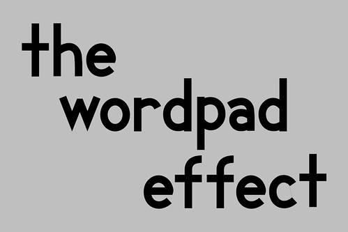
since the black-on-white experiment was a bust, i figured i'd try a couple more, this time with solid black text on a gray background.
75% white:
50% white:
25% white:
the results are roughly analogous to those from the white-on-black images: 75% white warps more than 50%, whereas 25% warps most of all.
clearly, it would seem that the source image brightness has an impact on warping, but it's not as simple as darkening an image to make it warp more. 
Thursday, September 02, 2010
greatest orchestra hits
here it is: the premiere of the new video from a huge smash!
a huge smash will be released for free download on september 14 at badtaste4life.com. 
a huge smash will be released for free download on september 14 at badtaste4life.com. 


